Wireframing
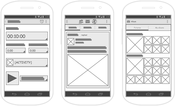
Wireframe shows how will the UI of your product look. It does not have any sophisticated visual design, in fact, it can be drawn on a piece of paper.
What Is a Wireframe
A Wireframe is a technical and visual representation of the UI. It ignores any visual design and focuses only on the content and the structure of the UI. Wireframing can be done by sketching it on a piece of paper or a whiteboard as well as by creating it in graphic design software.
Creating a graphic design can be very time-consuming. The Wireframe shows quickly if the scheme or the information hierarchy of the UI is correct.
Why You Might Want the Wireframe
Wireframes create a clear picture of the elements that will be developed. This tool is fast, cheap, and impermanent.
You can use the Wireframes to:
- see quickly if you did not forget anything.
- make changes to the UI scheme without ruining the visual design.
- transform it into a Clickable Prototype.
- test the UI on users (to a limited extent).
- test more variants of the UI on users at a low price.
- show to the business stakeholders to ensure that their requirements are taken into account.
- give the graphic designers a basis to create the UI.
- communicate the functionalities without the distraction of any visual design elements.
Problems the Wireframing Solves
- Increased cost
- Meaningless work
- Disconnect Between Business and IT
- Bad product-market fit
- Demotivated team
- Meaningless work
- Unsuccessful product
- Unnecessary functions
- Unhappy clients
How to Implement the Wireframe
As mentioned earlier, the Wireframe can be drawn on a piece of paper so it can be created very fast. It is important not to go into too many details. The Wireframe should be customized for the target group. For example, a user prototype needs to have a real content - high fidelity, but a graphic concept without any real content is enough for stakeholders - low fidelity. The Wireframe does not define the final look of the UI. It shows how the UI will work.
When drawing a Wireframe, follow these simple rules:
- Always use just a grayscale: white, black and shades of gray.
- Use a maximum of two fonts. If you want to show the hierarchy, use different sizes or styles of the fonts instead of changing the font.
- The text can be replaced with lorem ipsum.
- Avoid complicated pictures. Use simple objects like squares or rectangles. Examples: Instead of placing a real picture, write an "x". Instead of inserting a video, use a triangle (as a play button).
 Source: Visual Paradigm: How to Draw Wireframe for Android Apps?
Make your life easier and pick a tool for Wireframing, such as:
Common Pitfalls of Wireframing
It is common that the developers skip the Wireframing and create the UI directly. There is a risk of making some mistakes and it is more difficult and expensive to change it. When you present the Wireframe to the stakeholders, you can get stuck on the look of the Wireframe. This can be a result of the following examples:
- A lack of information The stakeholders cannot imagine how the UI will look. You did not explain to them that the Wireframe is for discussing the functionality, not the design.
- Too polished Wireframe You misjudged the detail and did not focus on the functionality enough.
- The stakeholders do not see their expectations You were too focused on your own image of the UI that the stakeholders' needs are missing.
Resources for the Wireframing
- Telepathy: Learning To Wireframe - 10 Best Practices
- A Medium Corporation: Getting Started With Wireframes
- The UX Review: Wireframes - The Beginner's Guide
- UX Design: User Flow Is The New Wireframe
- Visual Paradigm: How To Draw Wireframe For Android Apps
- InVision: How To Make Your First Wireframe
Was the article helpful?
Want to write for DXKB?
Feel free to contribute. People from DXKB community will be more than happy.
Prokop Simek
CEO
Related articles
ALL ARTICLES
Clickable Prototype
Clickable Prototypes are interactive demos of a website or a software application. These are often used to gather feedback early in the project lifecycle, before the project goes into the final stage of development.
Read moreValue Proposition
A Value Proposition Canvas is a model that helps to ensure that a product covers customer’s requirements. It defines the customer segment and the value proposition.
Read moreLean Canvas
A Lean Canvas is a 1-page chart with 9 basic building blocks. It helps to identify problems and solutions for your product.
Read moreDesign Sprint
A Design Sprint is a framework that reduces the risks associated with product development. It is an intense process done by a small team in just 3 - 5 days.
Read moreFail Fast
Fail Fast is a method used during a recurrent approach to determine whether an idea has a value for the client or solution. An important goal is to minimize losses when testing reveals something is not working and quickly try something else.
Read moreALL ARTICLES
Contribution
We are happy you want to contribute to DXKB. Please choose your preferred way